A coat of arms is a visual testimony, a way of saying in symbol what the heart believes and what a life is trying to live. In many places, coats of arms were historically granted to individuals and then handed down through their descendants. Here in the United States, there is no single governing authority for heraldry, so many families adopt what is called assumed arms, a personal design that is chosen, used consistently, and treated with respect, and then passed on as a family inheritance.
This is my personal coat of arms. I chose it intentionally, not as a claim to a famous bloodline, but as a statement of identity and mission. In fact, I am the first “Sisson” of my bloodline. I carry the surname through the man who raised me, my step-grandfather, and because of that, these arms represent a beginning, a new chapter, and a legacy I hope to hand down.
From top to bottom, the message is the same: forgiveness and redemption are real, and grace can transform a life. This coat of arms is my way of giving God credit for that work, and of remembering that the mercy I have received is also the mercy I am called to live and extend to others.
 I maintain two versions:
The Ornate Coat of Arms, used for ceremonial display and full presentation
The Non-Ornate Coat of Arms, used as a clean mark for letterhead, logos, and practical branding
The Motto
GRATIA DEI SUM ID QUOD SUM
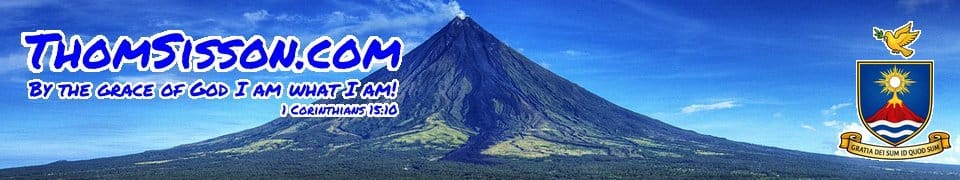
“By the grace of God, I am what I am.”
This line comes from St. Paul (1 Corinthians 15:10), and it captures the heart of what I want these arms to say. My life is not explained by my strength or my story alone. At the deepest level, I am who I am because of God’s grace.
Grace is not vague. It shows up in mercy. It shows up in forgiveness. It shows up in second chances, and sometimes in the kind of redemption you cannot explain without God.
There is also a second phrase that has shaped me deeply, “Here I am, Lord,” the posture of surrender and readiness. Even when my motto is St. Paul’s words, that is still the spirit behind it: I am here, I belong to God, send me.
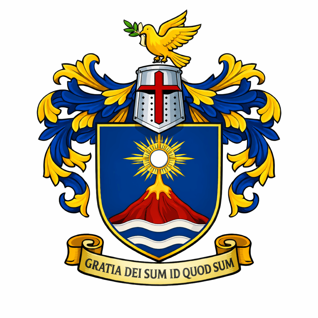
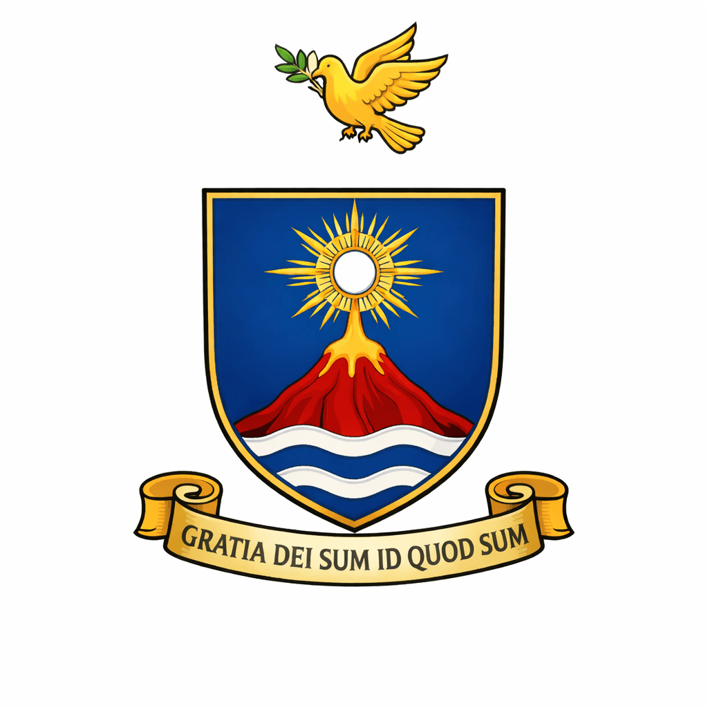
The Shield
The Blue Field
The shield is primarily blue, a color often associated with fidelity, stability, and heavenward focus. For me it represents faith, trust, and the desire to live with my eyes fixed on God, even in ordinary life. It is the backdrop of the story, the steady foundation, the reminder that God’s faithfulness is more stable than my weakness.
The Waves
At the base are wavy bars, symbolizing water. Water speaks to cleansing, baptism, life, and mercy. It reminds me that forgiveness is not an idea, it is something real God pours out.
But the waves also carry my personal story of movement and crossing.
I was born and raised in Missouri, growing up near the Mississippi River, and now I live near the Missouri River in Nebraska. In my move from Missouri to Nebraska, I symbolically crossed the Missouri River four times. Those waves represent that journey, the repeated crossing, the passage from one season of life to another.
They also connect to the sacraments that formed me across two dioceses. In the Archdiocese of St. Louis, I received the sacraments of Baptism, Reconciliation, and Holy Communion. In Omaha, I received Confirmation and Marriage, and I continue discerning holy orders. Both dioceses include rivers in their own coats of arms, and I love that detail. It feels like a quiet confirmation that the Church has carried me, step by step, across the waters.
So the waves hold multiple meanings at once: mercy and cleansing, yes, but also pilgrimage, formation, and the steady current of grace.
Mt. Mayon
Rising from the waters is a red volcano, a stylized image of Mt. Mayon in the Philippines. This is personal. My wife is from the Philippines, and my son is Filipino American. Mt. Mayon represents family, heritage, and the deep connection my home now has to that land and its people.
But Mt. Mayon is also a mountain, and mountains in Scripture are places where God speaks.
God calls Moses up the mountain. God strengthens Elijah on the mountain. Jesus is transfigured on the mountain. The top of a mountain is a place of encounter, a place where you hear what you could not hear in the noise below.
For me, Mayon symbolizes that same truth: God still calls people upward. God still speaks. God still reveals Himself, and often it is in the hard climb, through weakness and repentance, that His voice becomes clearer. Redemption is not just being forgiven, it is being lifted, changed, and drawn higher.
The Monstrance and Host Rising
Above the summit is the monstrance and the Eucharistic host, radiating outward like a starburst of light. This is the theological center of the whole design.
The message is simple: Christ rises above everything.
There is one more detail I had to have in this image. At the base of the monstrance, it looks almost like it is pouring into the summit, with three streams flowing down the mountain. That is intentional for me. It is a picture of grace in motion.
Those three streams also point to the three theological virtues, faith, hope, and love. When mercy reaches a person, it is not only forgiveness, it is formation. Faith is strengthened, hope is restored, and love is purified, until the whole life begins to move in the direction of God. God’s mercy is not something I only admire from afar, it flows into real life, into real places, into the hard places.
The Eucharist does not hover above my story, it enters it, and that is what redemption feels like, God’s holiness touching the messy parts and making them something set apart.
The Eucharist is not just a devotion, it is the Presence, Body, Blood, Soul, and Divinity. It is the source of strength. It is the point where love becomes tangible. The host rising from the mountain is my way of saying that Christ does not stay distant from the heights and chaos of human life. He enters it, sanctifies it, and draws everything upward.
If forgiveness is the beginning of redemption, the Eucharist is the food that sustains it.
The Crest
Above the shield is a gold dove carrying an olive branch.
This is the Holy Spirit, and it is also peace.
The dove represents God’s action, God’s guidance, God’s comfort, and God’s power to change a person from the inside out. The olive branch is a sign of reconciliation, mercy, and the ending of the storm. It ties directly to what I believe and to what I want my life to reflect: forgiveness received, forgiveness given, and peace that can only come from God.
The Crusader-Style Helmet
In the ornate version, the arms include a crusader-style helmet. I chose this not as a claim of membership in any historical order, and not as a political statement. I chose it because of what it symbolizes spiritually: service, sacrifice, readiness, and mission.
For me, it represents the call to be a servant of Christ, to protect what is good, and to take faith seriously. Not with aggression, but with discipline. Not with pride, but with responsibility. Mercy is not weakness, and forgiveness is not passive. Redemption calls for a response, a life that says, “Here I am, Lord,” and then follows through.
Ornate and Non-Ornate Versions
 Ornate Coat of Arms
The ornate version includes the full heraldic presentation: shield, crest, motto, and the crusader-style helmet. This is the version I consider the full achievement of my arms, the formal display.
Non-Ornate Coat of Arms
The non-ornate version removes the helmet and ornamental elements, keeping only the essentials: crest, shield, and motto. This is the version best suited for my website header, letterhead, and clean design uses, while still carrying the same meaning.
A Living Inheritance
This coat of arms is personal, but it is not meant to be private. It is meant to be lived.
It represents faith, service, love, mercy, forgiveness, and redemption, and it centers everything on the Holy Spirit and the Eucharist. If these arms ever become something my children and descendants carry forward, I hope they do not only inherit the design. I hope they inherit the message.
By the grace of God, we are what we are.
![]()